Lazy - We are Lazy but not lazy
Lazy is a house cleaning service company that is based in Hong Kong. Facing low awareness and to expand into international market, the brand recognised the need for change that would drive use and enable them to scale nationally.
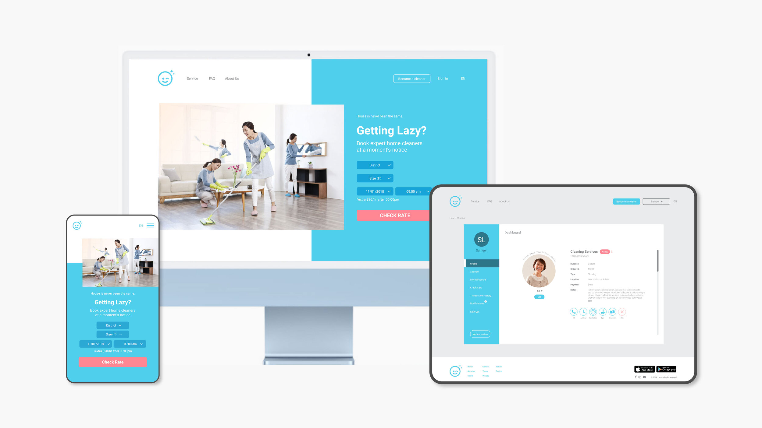
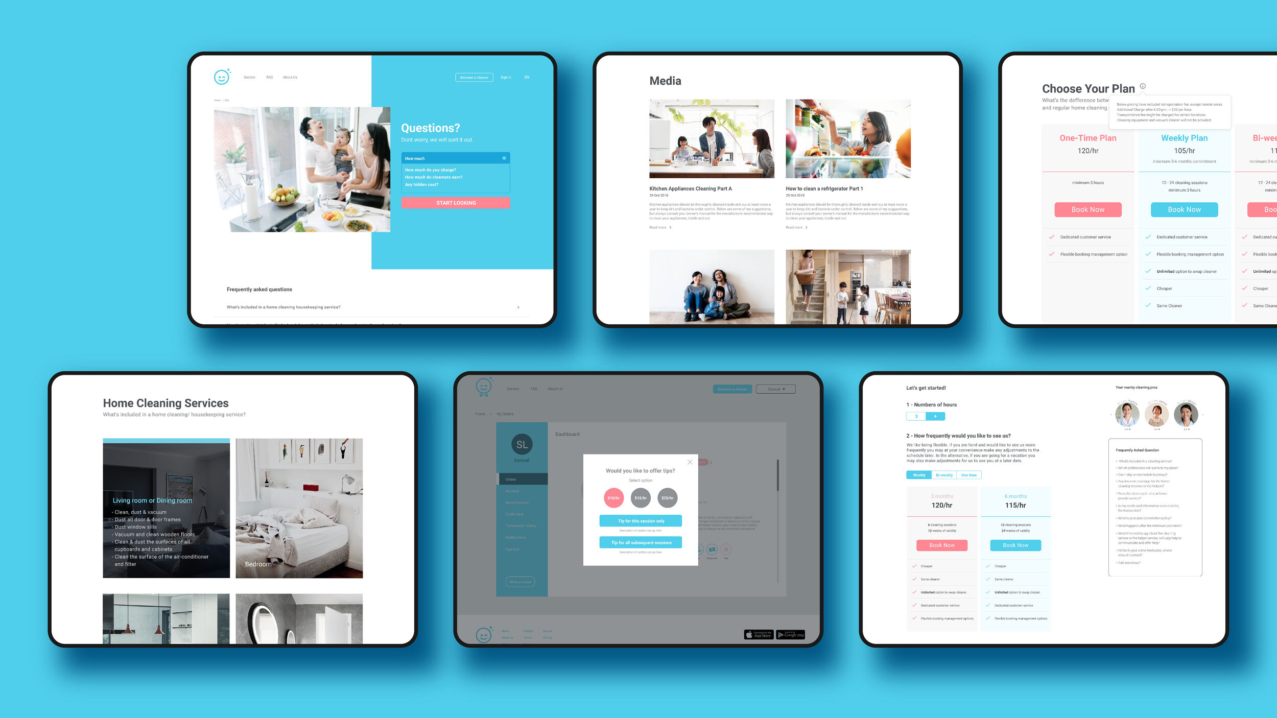
Hence, Lazy reached out to us to help revamp their brand identity and product. To clearly communicate Lazy’s offering, we changed the logo icon from a generic smiley face to a winking face with a slight smile and sparkles to connote a message - Don’t worry, it’s sparkling clean.

An enhancement has been made on the colours. There was a lack of contrast with the white background. While trusted and approachable, we decided to take a fresh look at their brand image, more closely aligning with the brand pillars and elevating it with vibrancy and sophistication.
The new enhanced brand identity would influence everything from their app, website and collaterals. It communicates the high-quality service we wanted our customer to expect. All in all, we are paving the way for the tremendous growth ahead.